Tuesday, February 27, 2018

LOGO DESIGN


MILTON GLASER (b.1929) 'I Love New York',1977


What is a Logo?
A logo is a sign, symbol, trademark or badge that conveys the identity or ownership of a product, company, campaign or concept in as memorable a way as possible.

How are logos used?
A logo can be used in many different forms, sizes, and contexts. For example, the logo for a hotel could be printed on a letterhead or menu, embroidered onto a napkin or jacket, embossed on metal cutlery or illuminated as a huge neon sign on the side of the building.

What are the basic qualities of a good logo?
A logo should be simple so that it retains its clarity of design in different contexts. If it is too complicated, its details may be lost when it is reduced in scale. Also, a simple logo design is faster to read, easier to remember and consequently more instantly identifiable. The 'I Love New York' logo by Milton Glaser, one of the most reproduced logos ever, illustrates most of these basic qualities.

What is the main function of a logo?
A logo should convey an immediate and memorable identity and must connect with its target audience in a positive manner.

How have logos evolved?
Logos have been around in one form or another for several thousand years. The Ancient Egyptians are known to have branded domestic animals with hieroglyphs to mark their ownership. The Ancient Romans and Greeks marked their pottery to identify the manufacturer. The great faiths of the world have all adopted symbols for ease of recognition.
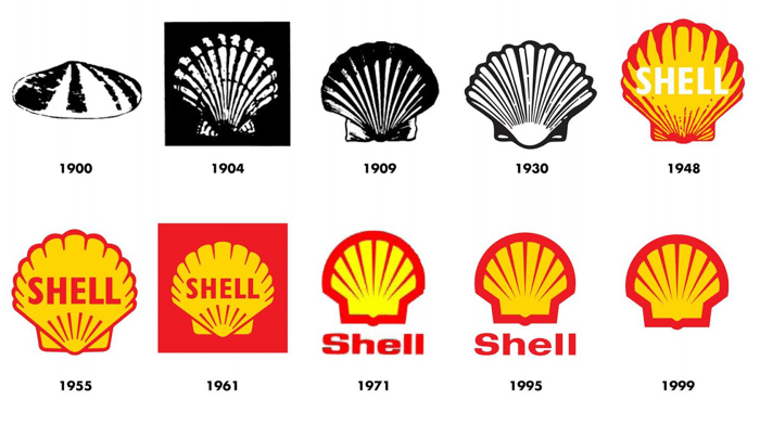
THE SHELL LOGO 1900-2012
What is Evaluation?
Evaluation is the skill of being able to look at a piece of art or design and know what is right or wrong with it. It is an instinctive skill but one that you can develop by increasing your knowledge and understanding of art and design through studying the work of other artists and designers.

Why do you evaluate your work?
You evaluate your work to find out what works and what doesn't. It is also important to understand what you have learned from doing the work. What are the new skills, techniques, and concepts that have you grasped through your involvement with the creative process? Each piece of work that you undertake should build upon your knowledge and understanding of art and design leaving you better equipped for your next challenge.

How do you evaluate your work?
When you are evaluating your designs you should consider the following:
Images
Fonts
Layout
Target Audience
Technique 

Images: Consider their suitability for the subject, their style, proportion, arrangement, and color. Could any of these be improved upon by making any adjustments?

Fonts: Consider their suitability for the subject, their legibility, style, proportion, arrangement, and color. Could these be improved upon by making any adjustments?

Layout: (the combination of images and fonts) Consider the proportions, arrangement, alignment, and color relationships of the various elements in your design.

Target Audience: (your client, buyers, users, readers, listeners) Does your design speak in a language, color and style that appeals to your target audience?

Technique: does your use of media, quality of finish and presentation need to be improved upon?


RUBRIC THAT WILL BE USED TO GRADE:
Logo Design Assignment
Student Name
Class:                                                            
Art Department Competition and Project
Directions:  Grade yourself by writing the number of what you think you earned on the assignment.  Answer the questions at the bottom of the rubric.
0-3
Poor. Not at all
3-6
Fair.
Met Basic Requirements
 7-8
Very Good.
Commendable Effort.
9-10
Excellent. Outstanding effort.
                                       /10
Originality/Creativity: The logo and other items are original, innovative, and inspired. They are not directly copied from the internet or traced.  All artwork used to create the logo is original. There is evidence of this by the completion of the original thumbnail sketches.
(3 thumbnail sketches were completed and turned in to Mrs. Hurd).
                                       /10
Logo Design Concept: The logo includes a symbol and text.  Logo represents the business effectively and clearly. The logo meets the criteria for effective logo design. Two sketches were completed.
/10
Technical Elements: The craft of the final logo shows skill in creating shapes, treating text effectively, choosing and using color, and good use of negative space.
                                       /10
Effort and Participation: The student was cooperative during instructional and used all work sessions productively.  The student made an effort to contribute positively to the classroom environment. Excellent effort is evident. Personal Growth: The logo design show that student challenged his/her self. The student put time and effort into developing idea.  The work shows improvement from the student’s previous projects
/10
Presentation: The final presentation is a good example of 2-d composition and unity of elements.  Technical skills are evident and there are not smudges, creases, or folds visible on the artwork.
___________/Total pts.
X’s 2= final grade
Please answer:
  1. If you had the opportunity to change anything about your logo, what would that be?


  1. Do you feel your logo design is effective? Explain why or why not.


Design a mule logo


Directions:
Today do two google searches.  
  • First, search for 3-5 REAL LIFE mule pictures for inspiration.  Save these images to your student file.  Copy and Paste these images into a word document, or a photoshop document and print out to turn into Mrs. Hurd.
  • Second, search for 3-5 school mascot logos that you like, these will also serve as inspiration. Again, save these images to your student file.  Copy and Paste these images into a word document, or a photoshop document and print out to turn into Mrs. Hurd.

Friday, February 23, 2018

Computer Assisted Art Digital Notan # 2

Directions:  Find an image and save to your student folder.
Open the saved image in photoshop and follow the tutorial provided below.  When you have completed the tutorial and created a complementary image (two colors that are opposite on the color wheel) repeat the Notan exercise from yesterday using the lasso tool.


https://creativepro.com/turn-color-photos-duotones-photoshop/

Thursday, February 22, 2018

Digital Notans- Computer Assisted Art

First Image- Black and White-Symmetrical Notan
Image result for digital notans

Step 1:  Find a picture on your phone, Facebook, Instagram, etc... that you have personally taken.  Save that photo to your student drive.

Step 2:  Open Photoshop on your computer.  <File<New create an 8.5 x 10 inch image 200 ppi


Step 3: <File<Open<Open saved image

Step 4: Use the Crop tool to crop the saved image into a perfect square.

Step 5: <Image <Adjustments <Hue & Saturation
Desaturate the image so that it is black and white.
You may also want to <Image < Adjustments < Brightness Contrast and adjust to your liking.

Step 6:  Use the Rectangle Marque tool to select the entire image.
<Edit<Copy

Step 7: Go to the new blank image and paste the picture.  <Edit < Paste
Use the move tool and move the image into the center of the white paper.
You may also need to resize the image- if so use ctrl + T

Step 8:  It is time to start removing bits of your picture and flipping them out.  This will create positive and negative spaces.  Make sure to use organic shapes during this process.  
Organic shapes are shapes that come from nature and are curvy.


Click on the Lasso tool.  Click and hold the lasso tool and draw a shape that you would like to cut out.
Use the move tool to move the shape.
<ctrl + t to transform and flip the shape.
Repeat until the image is completed.


Wednesday, February 21, 2018

Japanese Notan

https://prezi.com/7z1wsn_reepq/japanese-notan/

Computer Assisted Art- Notan Designs

Notan is described as a guiding principle of Eastern art and design that focuses on the interaction between positive and negative space...the light and the dark...in it's simplest form, think of a yin-yang.
Traditionally they are made from cut paper designs, however, for this project, we will be creating a digital version.

Image result for yin yang

Copy these notes into your sketchbook.

 
Complete the worksheet while viewing Prezi.
https://prezi.com/7z1wsn_reepq/japanese-notan/
Use this website to define the terms in your own words:
https://www.moma.org/learn/moma_learning/glossary


Assignment:
You will be making TWO Digital Japanese Inspired Notans
  • The first one....
You will use a black and white image that you personally take (must be cropped to square) and must be symmetrical.
  • The second one....
Will use a color image that you personally take (must be cropped to square) and must be asymmetrical.  I will show how to turn this color image into a complementary colored photo.

Tuesday, February 20, 2018

Thursday, February 15, 2018

1)   --->How to add color to your shapes.
Click Insert

Click Shapes
Click Free Form Shape
Click on the desired shape you wish to fill in.
Click Fill Color, Click Shape Fill, Click more colors and choose what color you would like.  Keep repeating until you have added color and pattern to the entire image.


Keep adding circles and lines until the entire thing is filled.  Next add color to all the shapes using the free form tool.

Be sure to double click the header section and add your name. And Always SAVE your work.

Print 2 copies and hand in to Mrs. Hurd.


How to add color to your Folk Art Project


Day One:
Watch video and Complete worksheet.
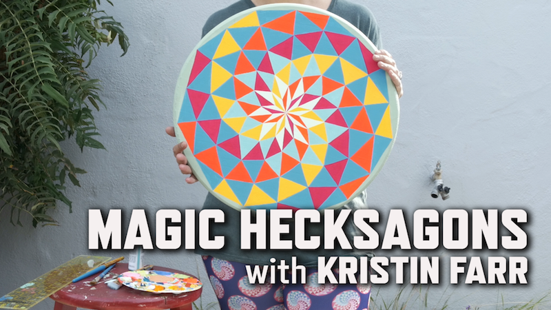
Inspired by traditional art forms and neon colors of the ’80s, artist Kristin Farr explores a legacy of folk art infused with her own contemporary viewpoint. Then Farr shows you how she creates one of her signature paintings: the Magic Hecksagon. Follow along as she measures and designs a hexagon pattern, then add your own magic colors to it! Check out the entire collection of KQED Art School videos!


Magic hexagons from Natalie Hurd


Day Two:

1)  POWERPOINT --->How to create the layout
Follow the step by step instructions and begin creating your design inspired by Kristin Farr

How to make a magic hexagon design from Natalie Hurd


HERE ARE SOME DESIGNS TO INSPIRE YOUR CREATION!!!
you may google Kristin Farr to see more designs, or google HEX Signs
Related image
Image result for kristin farr neo folk art
If you have finished the design for today watch the video and create thumbnail sketch/artist plan
https://ru-clip.com/video/9gpnmZc7F9M/painting-magic-hecksagons-with-kristin-farr-kqed-arts.html
Image result for painting magic hexagons kristin farr

Wednesday, February 14, 2018

Drawing Class- Portrait Project- Peter Max inspired

GREAT WORK FCHS DRAWING CLASSES!!!

Video One:


Portrait Project

Video Two:

FCHS Drawing Class 2018

This has been a wonderful project.  You can find the original post here.  I am so proud of these students.  They all have put in a lot of hard work and effort into creating these 70's inspired Psychedelic Portraits.
Inline image

Tuesday, February 13, 2018

Intro to Art-Typography Demuth

Day Three

Project Objective:
You will be creating a typography design in Microsoft Word.  You will learn how to create a grid using Microsoft word. 

When you are finished you will have something that resembles this below.  You will need to save to your student folder, and you will need to print out 2 copies of your design.

  • Choose 5-7 letters, numbers, & characters to draw.
  • The letters and numbers can have meaning, or they can be completely random.
  • Overlap, twist (rotate), and have letters go partially off the page to make the composition more interesting.
  • Create a design using Microsoft Word.
  • Try to use each of the three types of lettering. Gothic, Roman, Serif, Sans Serif
  • Try to vary the sizes and angles of the letters and numbers.
  • Follow the instructions below.

Instructions:
Creating the Composition
  1. Open Microsoft Word
  2. Create a New Blank Document
  3. Click Layout
  4. Click Orientation 
  5. Click Landscape
  6. Click Align
  7. Click Grid Settings
  8. Check Display gridlines on screen
  9. Type 12 in the Vertical Box
  10. Type 12 in the Horizontal Box
  11. Click Insert
  12. Click Word Art
  13. Choose a letter or number and adjust Font, Font Size
  14. Move the Letter or Number to the desired area on grid
  15. Repeat steps 11-14 creating new letters and numbers in different fonts and sizes.
  16. Double Click on the Heading portion and type your name.

Creating the Grid
  1. Click Insert Shapes
  2. Click Line 
  3. Trace over the all the gridlines using the shape, line tool.
  4. Save to your student folder NOT THE COMPUTER
  5. Print 2 copies of the image.

Monday, February 12, 2018

Crafts-Neo-Folk Art

Day One:
Watch video and Complete worksheet.
Inspired by traditional art forms and neon colors of the ’80s, artist Kristin Farr explores a legacy of folk art infused with her own contemporary viewpoint. Then Farr shows you how she creates one of her signature paintings: the Magic Hecksagon. Follow along as she measures and designs a hexagon pattern, then add your own magic colors to it! Check out the entire collection of KQED Art School videos!


Magic hexagons from Natalie Hurd


Day Two:

1)  POWERPOINT --->How to create the layout
Follow the step by step instructions and begin creating your design inspired by Kristin Farr

How to make a magic hexagon design from Natalie Hurd


HERE ARE SOME DESIGNS TO INSPIRE YOUR CREATION!!!
you may google Kristin Farr to see more designs, or google HEX Signs
Related image
Image result for kristin farr neo folk art
Image result for Hex signs

1)   --->How to add color to your shapes.
Click Insert

Click Shapes
Click Free Form Shape
Click on the desired shape you wish to fill in.
Click Fill Color, Click Shape Fill, Click more colors and choose what color you would like.  Keep repeating until you have added color and pattern to the entire image.

2)  THUMBNAIL SKETCH Kristin Farr Tutorial:
If you have finished the design for today watch the video and create thumbnail sketch/artist plan
https://ru-clip.com/video/9gpnmZc7F9M/painting-magic-hecksagons-with-kristin-farr-kqed-arts.html

Image result for painting magic hexagons kristin farr

Intro to Art Typography Language

DAY ONE:
LetteringBasics Basic Parts of a Letter


The Language of Lettering

Directions: Copy these notes down (you may shorten and put in your own words).  Draw your own diagram of the lettering image above and label. Turn in at the beginning of class tomorrow 2/13.
  • Typography is the design and use of typefaces as a means of communication.
  • Typography began with the first printing press-the Gutenberg, but really has its roots in hand-lettering (Calligraphy, Illuminated text, etc.).
  •  Lettering or typography is a very important part of visual communication. Fonts can communicate strength, power, emotion and personality. 
Think of some company logos that are just a typeface (Coke, Fender, Canon, etc.) What color are they? What does the construction of the typeface communicate about the company?

Parts of a Letter:
·        Basic listLetter Anatomy by Eric Miller -excellent information!
  • Baseline: the invisible bottom line on which characters sit.
  • Meanline: the middle line that is at the top of most lowercase letters such as “o,” “p” and “r.” It is also at the curve of letters like “h.”
  • Cap Height: the distance from the baseline to the top of uppercase letters like “B” and “H.”
  • Ascender: The part of a character that extends above the meanline.
  • Descender: The part of a character that extends below the baseline, such as the bottom stroke of a “g.”
  • Stem: The stem is often the main “body” of a letter. The vertical line of a “B” and the primary diagonal line of a “V”.
  • Crossbar or Arms: Bars are horizontal or diagonal lines of a letter, also known as arms, and are open on at least one side. “E” or “T”

Serifs, Cases & Styles of Lettering
  • Serifs: Fonts are often divided into serif and sans serif. 
  • Serif fonts are distinguishable by the extra decorative line (style endings) at the ends of the character (examples of serif fonts are Times Roman and Georgia )
  • Sans serif do not have the extra decorative lines. (examples of sans serif fonts are Arial and Impact)
  • There are 3 “cases” in lettering: UPPER, lower and Mixed
4 Main Styles of Lettering:
  • Roman Style, a “thick and thin” letter, often has the thickness in different stem places. It usually has “serifs” on each stem end.


IF YOU FINISH EARLY: GO TO THE NEXT BLOG POST AND WATCH THE POWER POINT ABOUT CHARLES DEMUTH AND BEGIN TAKING NOTES.


Intro to Art- Typography

lesson inspired by https://createartwithme.com/font-styles-lettering-design-mixed-media-lesson/
Day Two
WHAT DO YOU THINK ABOUT THE POEM?  

Look at the artwork below  LIST WHAT YOU SEE... what are the elements and principles....?  Use the back of your worksheet.


Directions:
Complete your worksheet by viewing the power point presentation. Turn paper in to Mrs. Hurd at the end of the hour.


Demuth typography from Ondrian Duncan Reid

Day 3Instructions:
  1. Choose 5-7 Letters, Numbers & Characters to draw.Create the Design on the computer using Word or Docs:
  2. Use Microsoft Word or Google Docs to create your basic composition.
  3. Insert “word art”-the outline only style- individually of 5-7 Letters, Numbers & Characters.
  4. Overlap, twist (rotate), and have the letters go partially off the page to make the composition more interesting.
  5. Save the document to the desktop as “Your Name ART”.
  6. Must use each of the 4 styles of lettering for a different letter or number (there will be repeated styles depending on how many letters you put in your design).

Tips for design:
Vary the sizes and angles of the letters/numbers
Overlap some of the letters/numbers.

Have some of the designs go off the page.

3 inch GRID image

On a 12×18” sheet of white paper, in pencil draw a 3” square grid.
(Or create random diagonal lines- I’m going to do this next time!)

Draw your design in pencil. Draw light until you know its right!!!

LETTERS, Numbers & Characters:  will be rendered in color. Use colored pencils/markers for the letters/numbers. 

Make sure you choose your focal point to be in color and balance the other colors throughout the piece.

BACKGROUND: background will be in black & white-create a positive & negative space reversal patterns in your art. Use Sharpies for the background. Create various patterns in the background to change the values.