Monday, February 12, 2018

Crafts-Neo-Folk Art

Day One:
Watch video and Complete worksheet.
Inspired by traditional art forms and neon colors of the ’80s, artist Kristin Farr explores a legacy of folk art infused with her own contemporary viewpoint. Then Farr shows you how she creates one of her signature paintings: the Magic Hecksagon. Follow along as she measures and designs a hexagon pattern, then add your own magic colors to it! Check out the entire collection of KQED Art School videos!


Magic hexagons from Natalie Hurd


Day Two:

1)  POWERPOINT --->How to create the layout
Follow the step by step instructions and begin creating your design inspired by Kristin Farr

How to make a magic hexagon design from Natalie Hurd


HERE ARE SOME DESIGNS TO INSPIRE YOUR CREATION!!!
you may google Kristin Farr to see more designs, or google HEX Signs
Related image
Image result for kristin farr neo folk art
Image result for Hex signs

1)   --->How to add color to your shapes.
Click Insert

Click Shapes
Click Free Form Shape
Click on the desired shape you wish to fill in.
Click Fill Color, Click Shape Fill, Click more colors and choose what color you would like.  Keep repeating until you have added color and pattern to the entire image.

2)  THUMBNAIL SKETCH Kristin Farr Tutorial:
If you have finished the design for today watch the video and create thumbnail sketch/artist plan
https://ru-clip.com/video/9gpnmZc7F9M/painting-magic-hecksagons-with-kristin-farr-kqed-arts.html
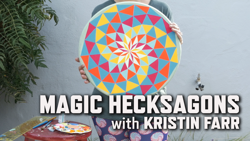
Image result for painting magic hexagons kristin farr

Intro to Art Typography Language

DAY ONE:
LetteringBasics Basic Parts of a Letter


The Language of Lettering

Directions: Copy these notes down (you may shorten and put in your own words).  Draw your own diagram of the lettering image above and label. Turn in at the beginning of class tomorrow 2/13.
  • Typography is the design and use of typefaces as a means of communication.
  • Typography began with the first printing press-the Gutenberg, but really has its roots in hand-lettering (Calligraphy, Illuminated text, etc.).
  •  Lettering or typography is a very important part of visual communication. Fonts can communicate strength, power, emotion and personality. 
Think of some company logos that are just a typeface (Coke, Fender, Canon, etc.) What color are they? What does the construction of the typeface communicate about the company?

Parts of a Letter:
·        Basic listLetter Anatomy by Eric Miller -excellent information!
  • Baseline: the invisible bottom line on which characters sit.
  • Meanline: the middle line that is at the top of most lowercase letters such as “o,” “p” and “r.” It is also at the curve of letters like “h.”
  • Cap Height: the distance from the baseline to the top of uppercase letters like “B” and “H.”
  • Ascender: The part of a character that extends above the meanline.
  • Descender: The part of a character that extends below the baseline, such as the bottom stroke of a “g.”
  • Stem: The stem is often the main “body” of a letter. The vertical line of a “B” and the primary diagonal line of a “V”.
  • Crossbar or Arms: Bars are horizontal or diagonal lines of a letter, also known as arms, and are open on at least one side. “E” or “T”

Serifs, Cases & Styles of Lettering
  • Serifs: Fonts are often divided into serif and sans serif. 
  • Serif fonts are distinguishable by the extra decorative line (style endings) at the ends of the character (examples of serif fonts are Times Roman and Georgia )
  • Sans serif do not have the extra decorative lines. (examples of sans serif fonts are Arial and Impact)
  • There are 3 “cases” in lettering: UPPER, lower and Mixed
4 Main Styles of Lettering:
  • Roman Style, a “thick and thin” letter, often has the thickness in different stem places. It usually has “serifs” on each stem end.


IF YOU FINISH EARLY: GO TO THE NEXT BLOG POST AND WATCH THE POWER POINT ABOUT CHARLES DEMUTH AND BEGIN TAKING NOTES.


Intro to Art- Typography

lesson inspired by https://createartwithme.com/font-styles-lettering-design-mixed-media-lesson/
Day Two
WHAT DO YOU THINK ABOUT THE POEM?  

Look at the artwork below  LIST WHAT YOU SEE... what are the elements and principles....?  Use the back of your worksheet.


Directions:
Complete your worksheet by viewing the power point presentation. Turn paper in to Mrs. Hurd at the end of the hour.


Demuth typography from Ondrian Duncan Reid

Day 3Instructions:
  1. Choose 5-7 Letters, Numbers & Characters to draw.Create the Design on the computer using Word or Docs:
  2. Use Microsoft Word or Google Docs to create your basic composition.
  3. Insert “word art”-the outline only style- individually of 5-7 Letters, Numbers & Characters.
  4. Overlap, twist (rotate), and have the letters go partially off the page to make the composition more interesting.
  5. Save the document to the desktop as “Your Name ART”.
  6. Must use each of the 4 styles of lettering for a different letter or number (there will be repeated styles depending on how many letters you put in your design).

Tips for design:
Vary the sizes and angles of the letters/numbers
Overlap some of the letters/numbers.

Have some of the designs go off the page.

3 inch GRID image

On a 12×18” sheet of white paper, in pencil draw a 3” square grid.
(Or create random diagonal lines- I’m going to do this next time!)

Draw your design in pencil. Draw light until you know its right!!!

LETTERS, Numbers & Characters:  will be rendered in color. Use colored pencils/markers for the letters/numbers. 

Make sure you choose your focal point to be in color and balance the other colors throughout the piece.

BACKGROUND: background will be in black & white-create a positive & negative space reversal patterns in your art. Use Sharpies for the background. Create various patterns in the background to change the values.